

employer
roles
Design, development
challenge
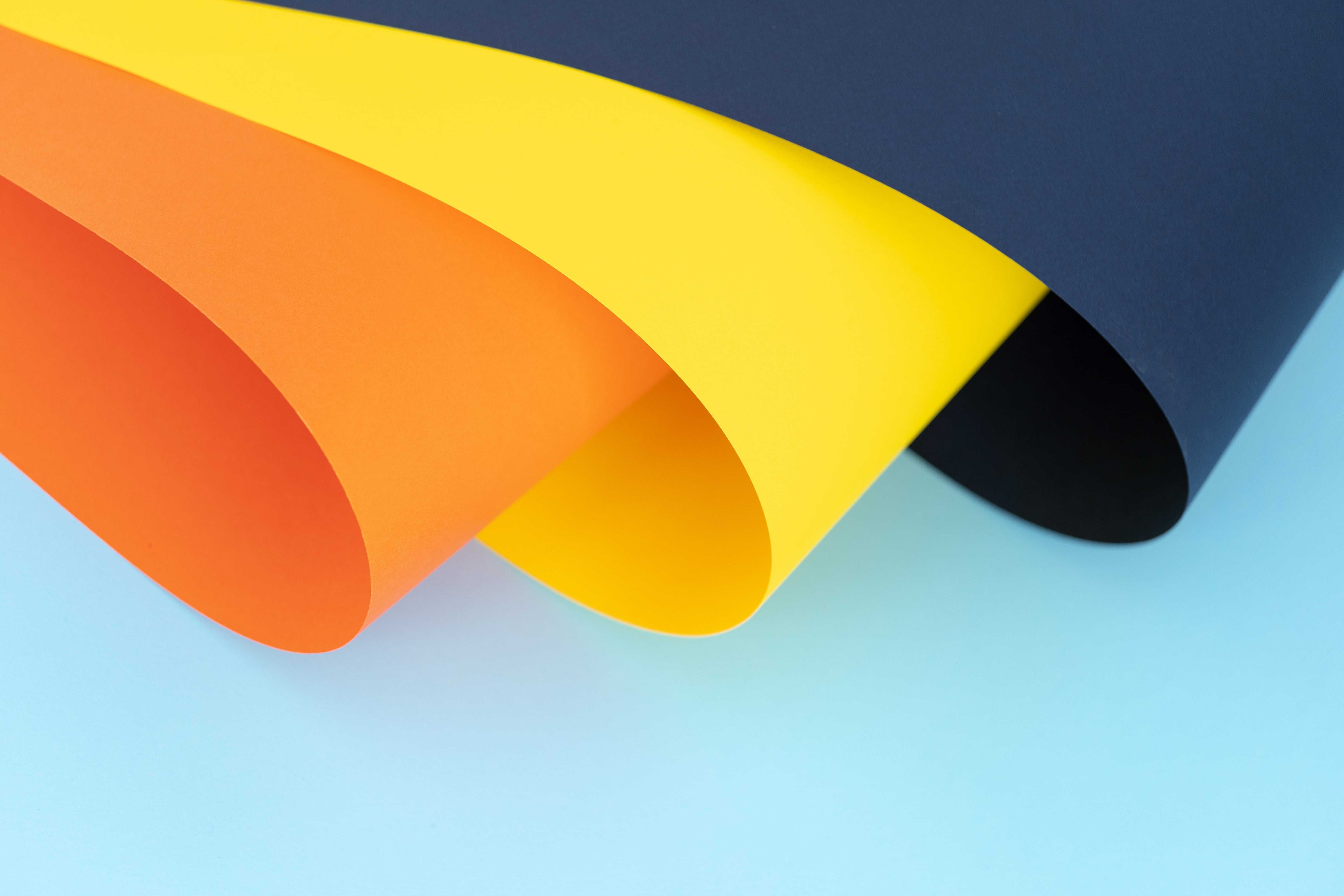
As a critical component of the corporate rebrand, marketing department needed a punchy and vibrant set of colors for its campaign needs, yet UX/product teams needed a reliable and predictable palette that maintains consistency. How to bridge the differing needs?
solution
Curate a vivid and vibrant main palette for all things branding and marketing, and craft a standardized set of variant tints to allow for consistent and accessible digital product development.
tools
Figma, React
Identity Colors
The identity-defining colors of Homepoint brand. Since they are core part of brand identity, one should not create a lighter or darker tint out of them.
Light Blue
#0D9BD5RGB: 13/155/213CMYK: 76/24/2/0PMS: 299CNavy
#0C3258RGB: 12/50/88CMYK: 100/84/39/32PMS: 648CGreen
#23D58CRGB: 35/213/140CMYK: 67/0/64/0PMS: 7479CSupport Colors
A complementary set of colors for visual accents and contrast. Each swatch can be used in ten different lightness with 500 being the standard primary tint of each hue. Warm hues are mostly reserved for charts, graphs, and otherwise UI distinctions,
Sky 500
#33A1CERGB: 51/161/206CMYK: 75/22/0/19PMS: TBDGrass 500
#40BF8BRGB: 64/191/139CMYK: 66/0/27/25PMS: TBDTurquoise 500
#46B7B2RGB: 70/183/178CMYK: 62/0/3/28PMS: TBDEggplant 500
#A54AB5RGB: 165/74/181CMYK: 9/59/0/29PMS: TBDPlum 500
#7842BDRGB: 120/66/189CMYK: 37/65/0/26PMS: TBDLemon 500
#FFB000RGB: 255/176/0CMYK: 0/31/100/0PMS: TBDOrange 500
#E4711ERGB: 228/113/30CMYK: 0/50/87/11PMS: TBDBerry 500
#C23F6BRGB: 194/63/107CMYK: 0/68/45/24PMS: TBDCool Gray 500
#628C9DRGB: 98/140/157CMYK: 38/11/0/38PMS: TBDNeutral Gray 500
#808080RGB: 128/128/128CMYK: 0/0/0/50PMS: TBDEvery support color swatch can be used in ten different lightness, each marked by a unique number: 50 being the lightest and 900 the darkest. Developed primarily for UI/UX needs, this system enables a wide variety of color combinations while ensuring proper contrast for accessbility and maintaining consistency.
T indicates that it passes WCAG AA and thus can be used as text color on white background.
Sky • HSL(197,61,50)• #33A1CE
Grass • HSL(155,50,50)• #40BF8B
Turquoise • HSL(177,45,50)• #46B7B2
Eggplant • HSL(291,42,50)• #A54AB5
Plum • HSL(266,48,50)• #7842BD
Lemon • HSL(41,100,50)• #FFB000
Orange • HSL(25,79,51)• #E4711E
Berry • HSL(340,52,50)• #C23F6B
Cool Gray • HSL(197,23,50)• #628C9D
Neutral Gray • HSL(0,0,50)• #808080
Creating combinations
Multiple lightness of a given hue enables a variety of impactful combinations, which can be especially useful in UI/UX design context.
Single-color examples
Two-color examples
Color in typography
When presenting written content, it's imperative to maintain proper contrast between background and text color. This standard lightness system makes it easy to ensure accessibility and keep brand consistency.
Basic color examples
White BG
HeadingHP Navy
HP Light Blue
Body textNeutral Gray 900
Cool Gray 900
Off-White BG (Neutral Gray 50)
HeadingHP Navy
HP Light Blue
Body textNeutral Gray 900
Cool Gray 900
HP Navy BG
HeadingWhite
HP Light Blue
HP Green
Body textWhite
HP Light Blue BG
HeadingWhite
HP Navy
Body textNeutral Gray 900
Cool Gray 900
Legible combination examples
The foreground/background combinations below can be used as body text (unless marked otherwise), as they pass WCAG Level AA requirements.
if you liked it